2021 Interior Trends: The power of colour
2021 Interior Trends
2021 Interior Trends: The power of colour
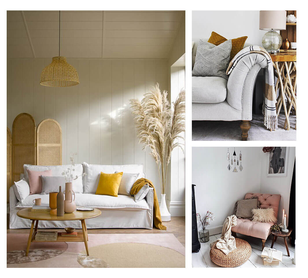
Colour has such a big impact on how a room looks, but also impacts the way it feels, and how you feel as a result. We took a look at the colours we’re going to be seeing more of throughout 2021, and how we can introduce them into our homes this year. From pops of bright colour to calmer, more serene colour schemes, there’s something for every home.
Colours of the tropics
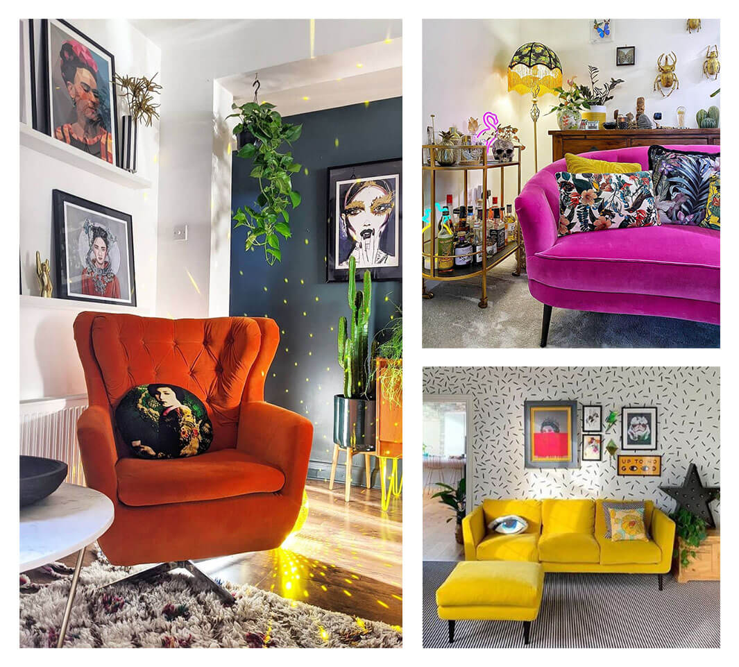
Bright colours with a tropical influence are likely to be on the rise this year, as we continue to yearn for distant shores and escapism to paradise. Not only will these warm and comforting colours remind you of holidays past and future, but they will also bring positivity and joyfulness to your space, creating your very own paradise in which you can switch off and recharge.
Bringing back vibrant colours and jewel tones that are full of life is the perfect way to create a home full of happiness. From tropical prints and floral palettes to Hawaiian inspired colour schemes, there’s no doubt that a playful nod to exotic destinations will put a smile on your face each day – refreshing and reinvigorating your home.
Go bold and make a statement by upholstering your furniture in tropical colours, from fuchsia pinks and burnt oranges to citrus yellows and palm tree greens, or keep the nod to tropical escapes a little more subtle, by keeping your space relatively neutral, and then accessorizing with gold side tables, bright coloured cushions, and patterned rugs.
2021’s Pantone colour of the year
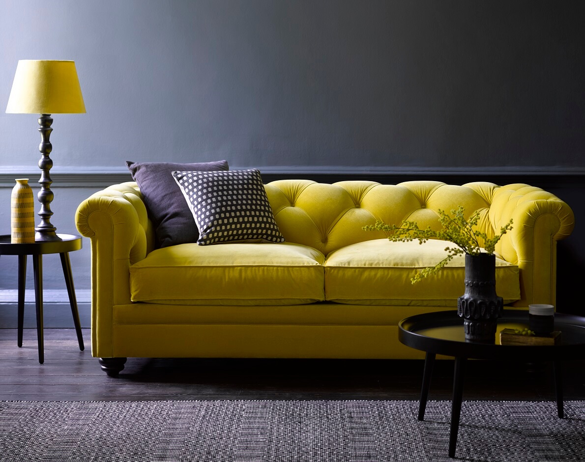
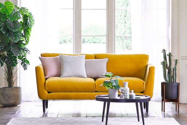
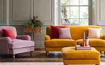
For 2021, Pantone have chosen a combination of two colours for their colour of the year – Ultimate Grey and Illuminating Yellow. By pairing a bold and bright colour, which is deeply connected to happiness and positivity, with a dependable and timeless shade of grey, the finishing result is that of comfort and optimism – much like sunshine on a cloudy day!
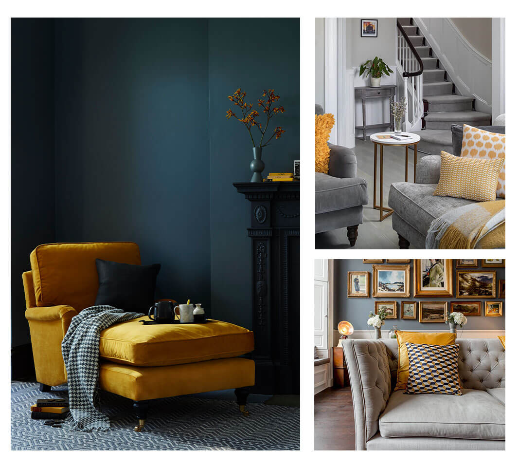
Grey is a versatile and ever-popular colour to work with, and has an incredible variety of hues to choose from. From dark, rich tones to lighter, more subtle shades, it’s the perfect foundation for a room. The bold and impactful yellow can be used as an accent in lighting or scatter cushions, but works equally well on your furniture upholstery, to make a real statement.
The two colours are very much independent of each other, but by bringing them both together, it shows how powerful unity can be – something that is more important than ever!
Ocean hues
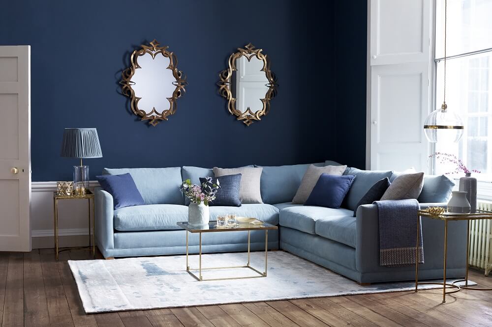
With a similar yearning for the coast, we are likely to see an increase in ocean hues, with pastel blues, and inky shades taking pride of place. The ocean is known for its calming influence, and these colours very much represent this feeling of peace and serenity, helping you to take some time out from a busy life to relax and enjoy your surroundings.
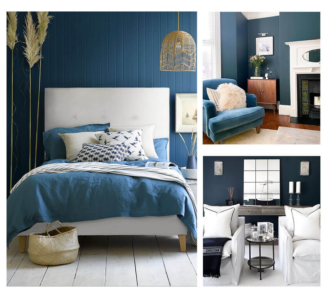
To achieve this look, consider adding pastel blue hues to the wall, and pairing this with lighter, more neutral tones, such as our Alabaster brushed linen cotton. Alternatively, combine shades of greys, blues and whites, and accessorize with nautical references, from circular mirrors to whitewashed floorboards, and dried pampas grass to achieve that nod to the peaceful seaside we are daydreaming of visiting again.
Earthy, grounded tones
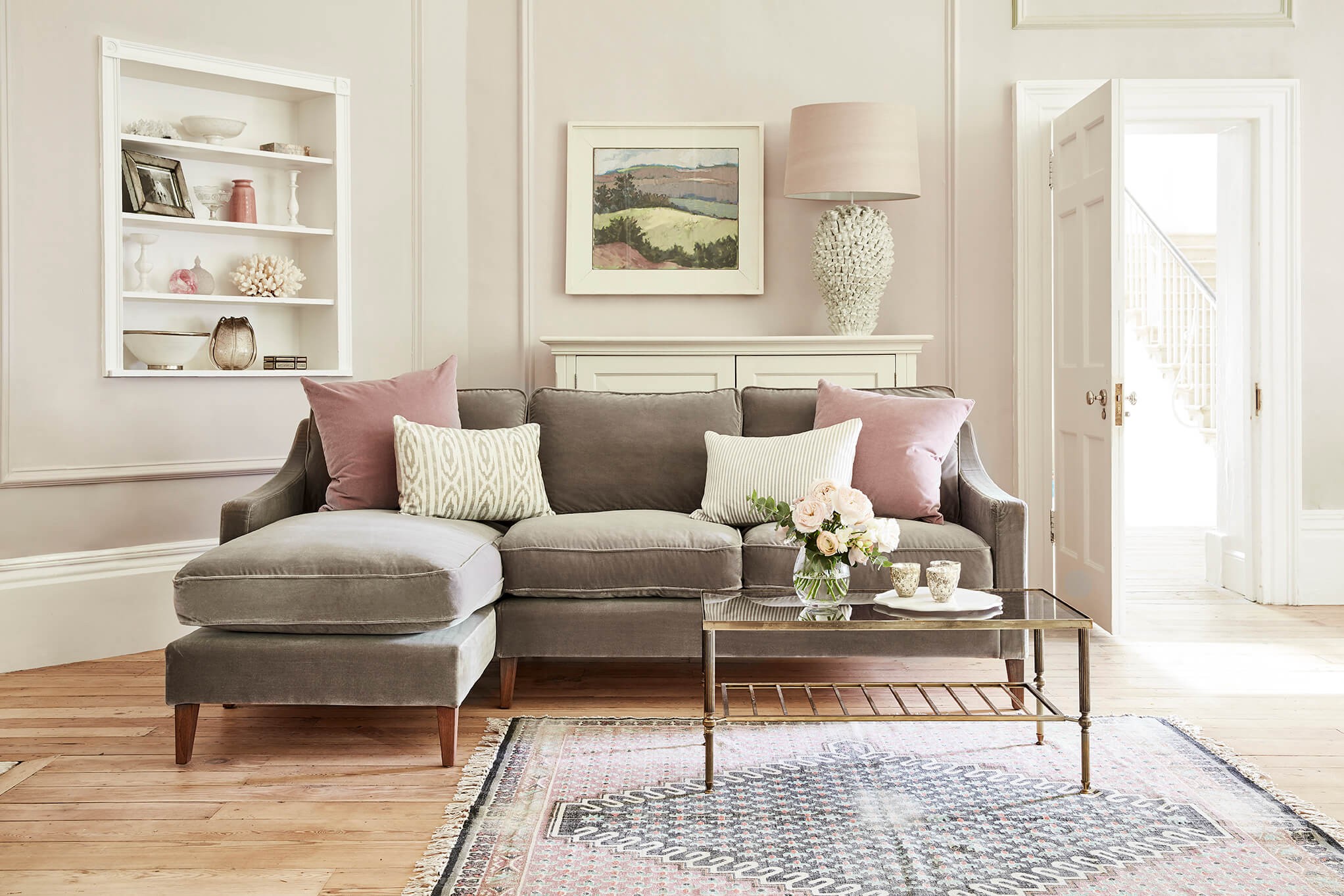
Last year reminded everyone of the importance of nature and it’s ability to help you feel grounded, from taking yourself out for a daily walk whilst working from home, to enjoying spending time with your friends and family outdoors. This love for nature has worked its way into our homes, and we’re seeing an increase in the use of earthy tones throughout different spaces – and this is further shown by Dulux’s colour of the year: Brave Ground.
