Shelves That Prove the Triangle Design Rule Is Worth It, According to Experts
Shelves That Prove the Triangle Design
Shelves That Prove the Triangle Design Rule Is Worth It, According to Experts

There are plenty of ways to approach shelf styling—just take a scroll through #shelfie on Instagram. But the overload of opinions can lead to major decor paralysis. That’s just one reason we love the triangle rule.
What Is the Triangle Rule?
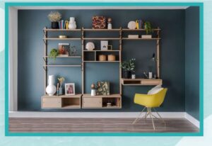
Ashley Baker, Senior Interior Designer at Vesta, is a huge fan of the triangle rule. She even posted this handy guide on her personal design Instagram feed, explaining what it all entails. The gist: things looked best when clustered in small groups that are arranged to create a multi-level triangular shape.
Connor Prestwood, Interior Designer at Dowsing & Reynolds, agrees. “[The triangle rule] helps lead your eyes around the shelves seamlessly and effortlessly, giving you something to continuously look at.”
How Does It Work?
“You can use the ‘Triangle Rule’ across different shelves, [or] on the same shelf,” explained Ashley. If you’re decorating a bookcase, then “choose three objects in the same color or material (they can vary in size with different visual weights, but these will be the anchor point to your ‘triangle’) and place them on the bookcase on different shelves in a triangular form. This will give your eye a geometric line to follow which will bring balance to the design.”
If you’re only decorating one shelf, then the basic principles are the same. “Group items and accessories together to create several triangular shapes,” said Ashley. “I recommend varying the triangles to add more interest and a more lived-in look. This will ensure all your ornaments, no matter how big or small, all look intentionally placed.”
If this is still sounding a bit too abstract, then Ashley has a few more specific suggestions for a flawless triangular execution. “Use asymmetric and triangular groupings of items to encourage a more organic feel [and] avoid anything feeling too staged.”
Arrange in Groups of 3 or 5
Just like a triangle has three points, the triangle rule is best executed with… you guessed it, three items. But if you have more than three, that’s ok, too. “Try to keep each cluster of items to an odd number,” said Connor. “Once you start having them in groups of twos and fours, they become too regimented and uncomfortable to look at.”
Once you’ve clustered your items in odd-numbered groups, it’s time to have fun. “With each cluster, play around with the levels and directions of your objects, adding layers for more interest,” said Connor. “Try to stay away from having similarly sized objects next to each other. Place objects in front and behind one another to help create depth of field and add more interest to the space.”
And if you’re stuck with an even number or can’t quite get the shape right, consider adding a plant. “Plants are a fantastic way to add life to your shelves!” said Connor. “With a choice of so many shapes and sizes, you can add variety across layers, height, and visual or textural interest. Ivy is a great choice of plant for a shorter layer, but can also be brought forward in front of other objects and be draped down over the edge of the shelf, guiding your eyes with ease to the next point of interest.”
Consider Color and Scale
As you consider which items to display, Emma Sims Hilditch of Sims Hilditch Interior Design suggests focusing on color and scale. “Incorporating books with beautifully colored spines to complement the palette of a room can help to bring the space together,” she explained. “We also recommend pairing old with new. For instance, antique pots placed thoughtfully next to a more contemporary glass vase can look lovely.”
As you add in more levels, consider the depth of your shelf, too. “If you feel your shelf is looking a little sparse, why not lean a framed painting or photo behind your ceramics, ornaments or books? This is a simple and effective way to add another dimension to your shelf styling.”
Anne R. Kokoskie of Styled by A.R.K agrees with Emma’s approach. “The color story should be limited to three colors and represented evenly on the shelves,” Anne explained. “The style elements should have the ability to stand alone or work together to balance scale and colors. For example, an object can be stacked on books to offset a vase with a similar scale beside it. This method is typically used in a space that has narrow shelves or [when] the shelves are the secondary site line. By minimizing the noise on the shelves, the hero moment of the room maintains the attraction.”
Embrace the Negative Space
One of the perks of the triangle rule is that it allows you to play with empty space, too. “Don’t be afraid of negative space,” said Ashley. “If you can’t fill a whole bookcase or shelf, [it’ll look] less cluttered.”
She also pointed out that “the triangle rule is a great way [to encourage yourself] to think about the vertical space, as well as filling the horizontal space. It reminds you to place items next to each other and not miles away.”
Step Back and Appreciate Your Work
As a final step for ensuring that your triangle rule is working, Ashley suggests taking “a picture of the bookcase or shelves when you think you’re done and check the balance of how you’ve placed your items. This allows you to step away and see it through different eyes.”
But as you look, remember: this is a guide and not a hard and fast directive. “You don’t need to create an exact triangular shape with lots of different heights,” said Ashley. “For instance, I sometimes use a photo frame as the endpoint although it’s not a literal ‘point.“
“Be bold and experiment; you can easily change things if they don’t work,” she added.
source :thespruce


