As a residential interior designer, Michelle Pollak, president of The Lollipop Tree, an interior design firm in Charleston, S.C., makes her living by combining colors to achieve a desired mood or effect. By following the traditional rules of color theory, she can produce kitchens and bathrooms that jump with energy or soothe the senses. Color theory tells us what hues give us that warm and cozy feel and which ones foster a cool, peaceful serenity.
“But before you can successfully apply color theory to interior design, you have to understand how it works,” Michelle says.
When coming up with a room’s color palette, Michelle takes three important things into consideration: her clients’ personal preferences, their lifestyle (how they intend to use the space) and the room’s physical structure (lighting and architectural details). With this information, she then can determine which colors and color scheme will best match her clients’ objectives.
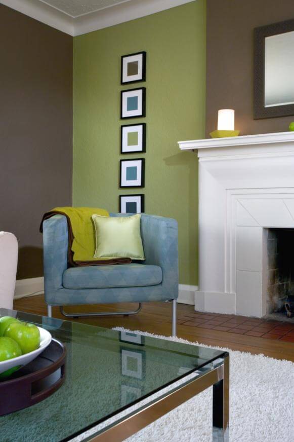
“There are just some color schemes that work better than others,” Michelle says. “Like if I walk into a country farmhouse kitchen, I automatically think of a monochromatic or analogous color scheme of creamy pale yellows or deep rich reds.” Conversely, a kitchen in a contemporary or modern house might be best served by bold, bright colors used in a complementary or triadic color scheme.
If her clients are looking to achieve a feeling of peace and tranquility, Michelle immediately considers a monochromatic or analogous color palette. “Think about the color scheme of a Hawaiian island and how restful it makes you feel,” she says. “The lush green hills, the blue ocean water and the pale blue sky — that is a classic analogous color scheme.” Bathrooms and spa rooms are ideal places to take color cues from nature, she adds.
To introduce a little bit more spark into a contemporary design pattern, Michelle moves to a complementary or triadic color scheme. “With each step up from monochromatic to analogous to complementary to triadic, you add a little more energy and a little more interest.”
Michelle cautions against injecting too much of a bright color in any room. “It is extremely important to balance colors with a lot of energy, because what might seem fun and exciting can become exhausting over time,” she warns. This is where the beauty of a complementary color scheme really shines. Because the colors are opposite each other on the color wheel, these color combinations always balance a warm hue with a cool hue.
As an interior designer who specializes in what she calls “integrative lifestyle design,” DeAnna Radaj, ASID, uses feng shui and color to achieve harmony and balance in one’s home environment.
Color is a powerful influence on our daily lives, explains DeAnna, owner of Bante Design in Milwaukee, Wis. By understanding the psychology of color, which identifies the psychological effects individual colors have on our minds and bodies, we can design rooms that foster health, well-being and prosperity.
DeAnna divides rooms into active spaces and passive spaces. Kitchens fall into the active category, while bathrooms tend to fall into the passive group. Because warm colors like orange and red represent energy and tension, they are best suited for active rooms like the kitchen. Alternatively, cool colors like blues and greens have a soothing and calming effect, making them ideal for passive rooms like the bedroom and bathroom.
“The kitchen is considered a fire room and the bathroom is a water room,” says DeAnna. But that doesn’t mean she recommends painting every wall in your kitchen red or every square inch of your bathroom blue. As in life, balance is key. “Too much of one color can create a numbing, exhausting affect on you and your family,” notes DeAnna.
DeAnna suggests following a color principal commonly referred to as the “60-30-10 rule.” For example, 60 percent of a bathroom or kitchen, typically the walls, should be one color of a color scheme. The color of the cabinetry and/or furniture accounts for the 30-percent figure. And accents and accessories such as plants, artwork and linens make up the remaining 10 percent.
And taking a lesson straight from the feng shui playbook, DeAnna strongly advises against painting your kitchen a vivid orange. “In feng shui terms, orange increases one’s appetite,” she says. “So unless you want to get fat, stay away from orange.”


