Harmonize the patterns
Allow more height to the ceiling

Harmonize the patterns
A living room usually has 5-6 walls and that includes the flooring. So if you think flooring would not bring any difference on the overall appearance, you’re absolutely wrong!
A brighter material for the flooring such as light oak or vinyl tile is a preference. You may also use rugs and carpet with cool colors to fully illuminate the flooring.
Patterned and printed rugs are examples of must used designs which makes your space look daring and bold.
Greg Natale
Harmonize the patterns
In constructing your homes it is more favorable when you make your ceilings as high as possible. This allows more natural light to be inside your room which will open up your space.
But if in any case you have already been dealing with small spaces, the only solution is same as what you did for the flooring.
Painting the ceiling with bright color make the eyes draw upward which makes it appears higher or taller. Or you can even put some striking art or wallpaper that can pull attention away from the corners of the room.
Take note of the color scheme.
Foley & Cox
Color is one great factor that everyone should watch out. It has a great effect on your interior; it can either make the area look bigger or much smaller.
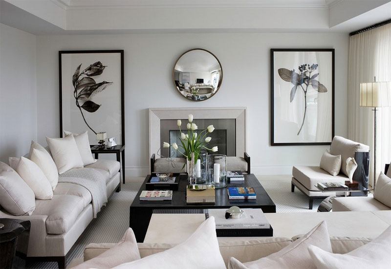
Bright and warm color must only be the choice. Examples of these are white, cream, or beige. These colors give an illusion of a larger room.
Make sure that your color scheme should be monochromatic.
What does it mean?
Apply one color for the wall, furniture, other accessories and fabrics. But if you wanted to have contrast, you can use different shades but of the same color only. Just like using different shades of yellow unto your drapes, throw pillow and other accessories.
Harmonize the patterns
Harmonize the patterns.
SchappacherWhite Architecture
To have unison in your decor avoid too many choices of prints. And also, stay away from many bold prints.
But if you really wanted to have it, one or two throw pillow or rugs with large geometric daring prints will do no harm.
In choosing wallpaper, it is much better to choose small prints with pastel colors or any vibrant shades. It is also effective to incorporate stripes into your decor. Horizontal stripes will visually widen a room while vertical stripes will make a low ceiling appear taller.
Take advantage of windows.
Kathleen Glossa Interior
Natural light is an unswerving source as space widener.
If luckily you are blessed with bigger windows take advantage of the natural light it has to offer. Leave it uncovered.
By doing so, you will open up your space and lighten up the area naturally. An airy and well-lighted room gives depth to it.
If you don’t want to have bare windows, find out what is the best window treatment you can use. You can have window treatments like blinds, curtains or drapes.
When adding drapes, choose the sheer style and make sure that the color of it unifies with the color of the wall. A drape printed with vertical stripes is a powerful trick for small room.
Brighten the room with lighting fixtures.
CWB Architects
There are varieties of lighting fixtures that you can use. But not all of it can be an ideal lighting for small rooms.
You must always identify the proper living room lighting ideas to have an effective design.
Small rooms have a propensity to be crooked and congested most especially when it’s dim. Installing proper lighting can make it appear bigger and brighter.
Using table lamps is fine but it must be with bigger shades. The perfect choices must be pendant light, floor lamp and recessed lighting. Adding lighting to the floor can also be a good plan.
Balance the furniture.
Claudia Stephenson
If you have small space, it does not automatically mean that you need only small sized furniture. And it doesn’t also mean that you cannot add beauty and convenience into your space.
Of course you can, given with some considerations and limitations. Through these considerations you’ll increase floor space and maintain a welcoming ambiance. Here are some points that you should take note:
- Try to utilize a lighter and smaller type of furniture. If you don’t want to give up your bulky sofa, okay then limit the use of side tables or accent tables. And as much as possible get rid of upholstered sofas that can visually eat up the size of your room.
- Choose sofa or chairs that have lightweight materials. Also, it would be much better to have furniture with exposed or raised legs and armless which creates a sense of openness. Integrating buoyant components into your design can open up things that allow your eyes to travel all throughout the space.
- It is a wiser move when you practice yourself to invest on multi-functional furniture. Just like having ottomans that can already serve as a chair or coffee table. There are also coffee tables and chairs that serve as a storage for things at the same time.
- Look for furniture that can just be easily stowed away when it’s not in use. Furniture that can be folded, piled, or swing away is the perfect choice for small space.
Take note of the furniture arrangement.
Claire Stevens Interior Design
Arranging your furniture in a proper way can improve the flow of connections between your spaces.
It is very much important to plan ahead on the sizes that will best go well with your space. It is not ideal to insist or to press in large furniture that doesn’t really fit in.
In arranging your furniture you must take note with the “3 foot rule”.
In order to have a comfortable walking space you must set a 3 foot distance in between furniture. This is very useful especially for furniture with drawers and doors.
Additionally, furniture like sofa and chairs should not be placed against the wall. Give it distance of at least 12” far from the wall.
And if you have curved corners it is better to fill-in those spaces to highlight the extent of the space making it look spacious.


