Home in on Happy… with Farrow & Ball
Home in on Happy
Home in on Happy… with Farrow & Ball

This week we sat down with the wonderful Patrick O’Donnell, from Farrow & Ball, to discuss the importance of colour in the home and the impact colour has on the way we feel.
Patrick is an international brand ambassador for Farrow & Ball, colour consultant and all-round expert in colour! After nearly 10 years with Farrow & Ball and as the leading man in their colour videos, Patrick is the perfect person to speak to about how to decorate your room, and using colour to create your very own happy place.
We’ve worked with Patrick to create three different colour schemes that will help inspire you to introduce colour throughout your home, from open-plan living spaces to calm living rooms and cosy bedrooms.
Open plan living
In recent times, there has been a marked increase in the popularity of open-plan living – a move from having separate living, dining and cooking areas to one big space where the whole family can come together, with an element of conviviality that allows family and friends to socialise.
For this space, Patrick has chosen to go with a theme that combines blues, yellows and whites. Big open spaces can take a bold colour such as bright yellows, particularly when it’s a lively space such as an open kitchen and living area, with lots of activity. The result is a simple and timeless colour scheme that will continue to be relevant over time – nothing is too overwhelming, but the space will be a bright and open place to spend time with friends and family.
“Bringing small pops of yellow into an otherwise relatively classic colour scheme introduces a joyful element to the space, and just makes you smile.”
Patrick has chosen Blue Gray in modern eggshell for the kitchen units, with ceilings painted in James White in modern emulsion – this bright white also has a hint of green running through it, making it slightly less harsh and allows it to tie into the rest of the colour scheme. Inchrya Blue in modern eggshell is a punchy blue that would work perfectly on a kitchen island, adding interest and building on the layers of blue already in the space.
Once you have the key paint colours in mind, you can look to upholstered furniture to add to the layers of colour in the space. Jade smart velvet is a great choice for upholstering bar stools to sit against the kitchen island, and the “smart” characteristic of the fabric means any spills or stains are quickly wiped away! For dining chairs, look no further than our Butterscotch cotton matt velvet – this colourful addition brings an element of luxe and sophistication, but is a warmer shade of yellow to add warmth to the space. Our uniform herringbone weave would be a great option for a sofa in this open-living space. The subtle herringbone pattern brings texture to the space, whilst the hints of blue will help to tie in with the kitchen space.
To finish the space, Patrick has sourced some stunning flooring tiles from Parkside tiles – deep blues with accents of light yellows will help to continue the tonality of blues, yellows and whites. The final touch is a stunning patterned material by Kravet, that brings together the colour scheme, and could be used on blinds within the open plan space.
Creating a relaxing living room
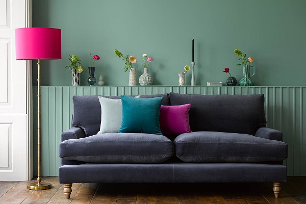
More than ever, people are turning to their living rooms to create their very own sanctuary, where they can spend quality time with the family. In the last year or so, people have become braver with colour, using shades such as inky blues and deep greens to create cosy and cocooning spaces that don’t feel too dark and dramatic. For a relaxing living space, Patrick has opted for a soft colour scheme with light pastel tones – soft and cool minty greens, combined with earthy pinks and plenty of tactile textures.
To start, Patrick has chosen Light Blue No in estate emulsion for the space, using School House White in estate eggshell for trims throughout the room. This white hue has a hint of yellow and green running through the colour, to add warmth and prevent it from feeling too harsh.
Our Olive cotton matt velvet is a stunning option for your main sofa, and is a great match for the hues within the paint chosen by Patrick. As one of our most popular fabrics at the moment, Olive green is a classic colour for relaxation – the connection to nature and the outdoors makes it perfect for the soul and the mind. Introduce a pop of colour by upholstering a button tufted footstool in Claret cotton matt velvet, then bring texture into the space by using our Alpaca textured boucle on an accent chair. This tactile fabric is soft to touch, and brings that element of cosy cocooning into the space.
“The whole idea of bringing nature home is a really lovely element of texture and comfort for a living space.”
To tie the colour scheme together, Patrick has sourced a gorgeous Vine linen from Tissus d’Helene, which is perfect for soft furnishings such as curtains and blinds to pull out the softer colours of the velvets and create a cohesive scheme. A natural flooring such as the Basketweave Seagrass from Crucial Trading is another textural element that also brings that connection to nature back to the forefront. Complete the look with scatter cushions in Stone brushed linen cotton and Mossymere Norfolk cotton – slightly different textures but all sit beautifully together.The result is a classic, soft and gentle colour scheme that is easy to live with, allowing you to relax with the whole family.
Cosy bedroom inspiration
The bedroom is an incredibly important space in the home – never underestimate the value of a good night’s sleep, and waking up feeling refreshed! For this space, Patrick has opted for a cosy, warm colour scheme with warm and earthy tones – a great big hug of a bedroom!
“For this colour scheme I’ve used rich earthy colours, and I think this would be lovely in a south facing room, so that the room gets drenched with sunlight.”
The first colour Patrick has chosen is Farrow and Ball’s Dead Salmon in estate emulsion – this is a salmon tone, with a dead flat finish (not inspired by a deceased fish as some may think!). This is a sophisticated pink tone with a brown hue, and works perfectly with the Slipper Satin in estate eggshell which can be used on the trims, with Slipper Satin in estate emulsion for the ceiling..
Our Dusty Rose cotton matt velvet provides the pop of colour in this space, and looks stunning against the Dead Salmon and Slipper Satin tones. Consider a statement headboard for this fabric, such as our Audrey with its mid-century curves that provides the perfect place to sit back with a cup of coffee and the morning paper. To ensure the room doesn’t feel too busy, add an accent chair in a more neutral fabric, such as our Orchid velvet or Stone brushed linen cotton.
Patrick has sourced a stunning printed linen, Bukhara from Tinsmiths, which is perfect for those all important finishing touches to tie all the tones within the colour scheme together with its bold design. To complete the space, Coloured Coir flooring from Sinclair Till is the perfect match – the herringbone design adds interest to the space, with a tactile feel and notes of each element within the colour scheme.
Patrick’s key pieces of advice when designing a space
Moodboards are your best friend
Before you begin anything, get your hands on as many samples as possible! From paint and wallpaper samples to fabric swatches, flooring tiles and other fabrics, being able to put them all together is the first, and most important step in putting a room scheme together. Switch things in and out of the scheme, layer them in different orders and keep playing until you find a combination that works perfectly for your home.
“A room is a sum of many different parts, so bringing the elements together physically and putting layers together is such an important part of the process”
Don’t feel like you have to follow trends
Trends are styles that come and go, so the danger with following a particular trend is that it may be considered unfashionable, or a design faux pas in the future. Timeless colour schemes are often the best solution, but that doesn’t mean you have to have a boring interior! Accessorise with scatter cushions, artwork, lamps and other additions that bring interest and colour into a space.
Make it personal
The most important thing when designing a space is that it reflects your own personality. Every home should represent the personality of the person who is living there, so make sure you bring elements of your personal life into the room, whether that’s photos and mementos to antiques, souvenirs and heirlooms. Find what makes your heart sing and build the scheme around it.
Don’t feel overwhelmed
It’s really easy to feel overwhelmed when first putting a room scheme together. There are so many options available to you, from paints and wallpapers to furniture shapes, sizes and fabrics, but don’t worry! There are teams of experts available to help guide you through each of these choices. Learn more about our complimentary Personal Shopping Consultations, and don’t forget Farrow & Ball also offer their own colour consultancies – redesigning a space should be something enjoyable after all!
source :sofa.com


