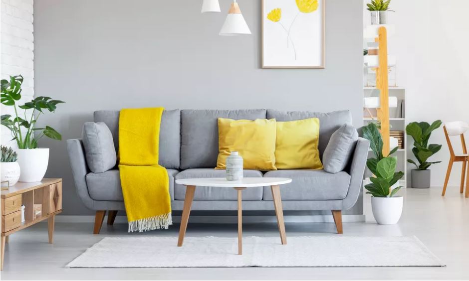
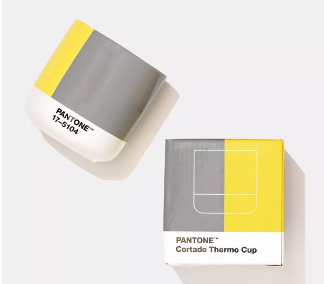
Picked for its message of “positivity supported by fortitude,” Leatrice Eiseman, Executive Director of The Pantone Color Institute feels that “this is a color combination that gives us resilience and hope.”
Since the 1960s, Pantone has understood and promoted the importance of color. As the inventors of the Pantone Color Matching System (a standardized color reproduction system used across a variety of industries), Pantone dictates the colors we see in print, paint, textiles, and plastics. In 1999, led by lifestyle and industry trends, the company announced its first-ever color of the year and on the brink of Y2K, it chose Cerulean.
It’s also worth noting that while the announcement is always widely anticipated in the fashion, textile, and design industries, the 2020 color of the year, Classic Blue (Pantone 19-4052), was met with some derision. At the time, Laurie Pressman, the vice president of the Pantone Color Institute, said, “It’s a color that anticipates what’s going to happen next. What’s the future going to bring as we move into the evening hours?”
It’s an interesting choice in hindsight and an even more interesting quote. Few of us could have predicted in December 2019 what could have happened in the coming year. But while Classic Blue was selected as “a reassuring presence instilling calm, confidence and connection,” picked for its “sense of peace and tranquility to the human spirit, offering refuge,” it’s likely not how many of us will remember 2020. Instead, we’ll look back at 2020 as a year dictated by a global pandemic. On the other hand, it also closed with an American election where the winning party’s signature color is none other than… Classic Blue.
So, what will 2021 and the year of Illuminating and Ultimate Gray bring? Only time will tell.


