Stunning Color Palettes for Earth Signs (That Aren’t Strictly Neutrals)
Stunning Color Palettes for Earth Signs
Stunning Color Palettes for Earth Signs (That Aren’t Strictly Neutrals)

When it comes to deciding on color palettes, it can be difficult to know where to begin. While we can easily search for the latest trends or base the concepts on our favorite colors, we also want to create an atmosphere that represents our personality. Referencing our zodiac signs, as well as color psychology, is a great way to help determine why we are drawn to certain colors and what they say about us.
For the earth signs of Taurus, Virgo, and Capricorn, the most common color associations that come to mind are neutrals. While neutral tones like black, tan, white, and gray certainly work well in representing the orderly, grounded, and simple aspects of these signs, there is much more to them than meets the eye. Your element may be in earth, but you shouldn’t feel you have to stick to those tones to reflect your true personalities–there are ways to bring color into your space that still rings true to who you are.
For each sign, we’ve given two different color palettes to help showcase some of your better-known qualities. From stunning soft pinks, darker blues, and golden hues, take a look at some stunning color palettes for your earth sign to inspire you to think outside the box.
Virgo: Peach, Dark Blue, Forrest Green
Often labeled as reserved, most would not assume that you would want to embrace much color–but they are underestimating you. You strive for an atmosphere that is well balanced and promotes calm and conversation. A peach-colored hue is a great way to brighten up your space, given its association with warmth and relaxation. Pair it with a deeper blue to create contrast and balance. Its association with intelligence and power are both traits that you admire. Flesh it out with a forest green that invokes growth and ultimately serves as a great backdrop for the other two to pop. All three colors have a way of making a statement without overshadowing each other–which is an ideal concept for you.
Virgo: Burnt Orange, Golden Yellow, Hunter Green, Rust Red
If you’re not one to opt for brighter tones, no worries. Another fantastic concept for Virgos includes working with colors that are darker and muted more than their originals. With Virgo season placed at the end of August and the beginning of September, it’s no surprise you would be drawn to a more autumnal color display. Burnt oranges, golden yellow, hunter green, and rust colored reds bring to mind the idea of clearing out what no longer suits us and planning ahead for what’s next–something Virgos are all too fond of. Naturally, using brown or gray as a background for these tones would make perfect sense, but won’t take the focus from them.
Capricorn: Emerald Green, Navy, and Gold
You aren’t one to go over the top with your style, but you will highly appreciate anything thoughtful and sophisticated. Emerald green takes center stage here, and is known to be a color representing prosperity, abundance, and growth. Given your determination for success and achievement, it serves as great inspiration for you to stay on track. Matching it up with navy blue, which is known to work well with most colors, is a great choice. Navy lends itself to feelings of power, authority, and respect–all solid qualities of a Capricorn. To keep things from appearing too heavy, accent with gold decor, to give off a sophisticated and elegant atmosphere without having to try too hard.
Capricorn: Magenta, Plum, and Black
This color combination seems a bit bold and dramatic, yet still resonates well with a Capricorn state of mind. The mostly black walls give a sense of certainty and security, and provide a perfect contrast to lighter options. Magenta is quite the attention grabber, yet it still manages to be more subdued than your standard reds or hot pinks. It promotes compassion and contentment, sides that you may not always be known for but absolutely possess. The plum forms a perfect segue between these two tones, causing less of a jarring contrast and forming a smooth transition. These three colors work to create an inspiring, luxurious space that showcases your creative side.
Taurus: Pale Pink, Mint Green, and White
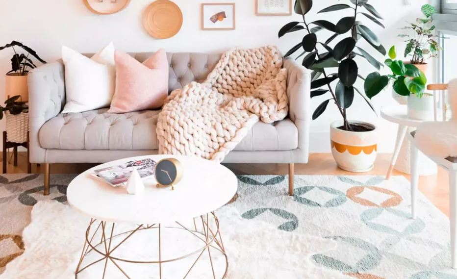
Out of all the earth signs, you’re much more receptive to brighter, more playful hues. Your personality reflects comfort, luxury, and a grounded mindset. Shades of pale pink and mint green bring to mind the image of flowers blooming and new life taking shape–as someone who delights in natural beauty, this is a delightful option. Pairing these with a shades of off-white creates a feeling of openness and space that gives you peace of mind. You can also work in various shades of green to add dimension, like a darker green printed accent wall or the natural brighter green of a houseplant. Ultimately these colors work together for a playful, brighter atmosphere that suits you.
Taurus: Lavender, Millennial Pink, Charcoal Gray, Gold
If you prefer to not exclusively work with brighter tones, this palette works well in your favor. While Taurus signs typically cherish natural beauty, they also have a soft spot for things that are luxurious and polished. This millennial pink promotes kindness, calm, and sensitivity. Pairing with a lavender purple that serves as a reminder of tranquility and elegance is a perfect way to set the scene for a dreamy state of mind. Add charcoal gray into the mix for a sense of security and authority that isn’t quite a harsh as black–a perfect way to stay grounded and present. For an additional touch of opulence, accent with small amounts of gold.
source : thespruce


