Using Colour with Confidence – Little Greene’s Top Tips
Using Colour with Confidence
Using Colour with Confidence – Little Greene’s Top Tips

For the first instalment of our #OnTheSofaWith… virtual event series, we sat down with Ruth Mottershead, Creative Director of Little Greene, to discuss all things colour! Having a calm and safe environment to relax in has never been more apt, and colour is such a key factor in creating your very own haven. But how do you know which colours work well, and how can you use colour with confidence? If you missed our live event, never fear! We’ve captured Ruth’s key advice and top tips on using colour with confidence in the home right here…
The importance of colour
Colour is all around us, and is extremely influential in everyday life – it can have an impact on how you feel, affect how a room looks and change the ambience of a space completely. Colours can make a room feel warmer, create the illusion of a larger space, make you want to snuggle up on the sofa, or increase your productivity.
When looking for the best colour paint or furniture to refresh or redesign a space, it’s important to remember that you will be living with it every day. Unlike a piece of clothing, it’ll be something you are around all the time, and is much harder to change, so it’s important to bear a few key considerations in mind…
How to start choosing colours for a space
-
What is the function of the room?
My first piece of advice is to consider the function of a space, as this will often help dictate the colours or tones that will work well. For example, a kitchen is often the hub of the home, and a hive of activity where family and friends gather to socialise, so you can typically be more adventurous with colour. In comparison, the bedroom is your place of rest, so you need to have a softer, more subtle and relaxing colour palette.
-
How much natural light does the room get?
Another key consideration is the amount of natural light, and the direction the room is facing – as this can impact the type of natural light that enters the room. For example, A north facing room will have cold light entering the room, so it’s really important not to use cold colours. South facing is the opposite – warm light entering a room will mean you might look at adding cooler colours to achieve that balance. An east facing room will get strong morning sunlight, so here you can use stronger, bolder tones, whilst west facing rooms receive a warmer orange light at the end of the day so try to avoid those tones in paint colours.
-
What is the size of the room?
The next step is to look at the size of the room. There’s a common misconception that you should brighten up smaller rooms as much as possible to make them feel larger, but why not embrace the small size, and use rich dark tones to create a cosy and more intimate feeling?
Three colour palettes to make your home a haven
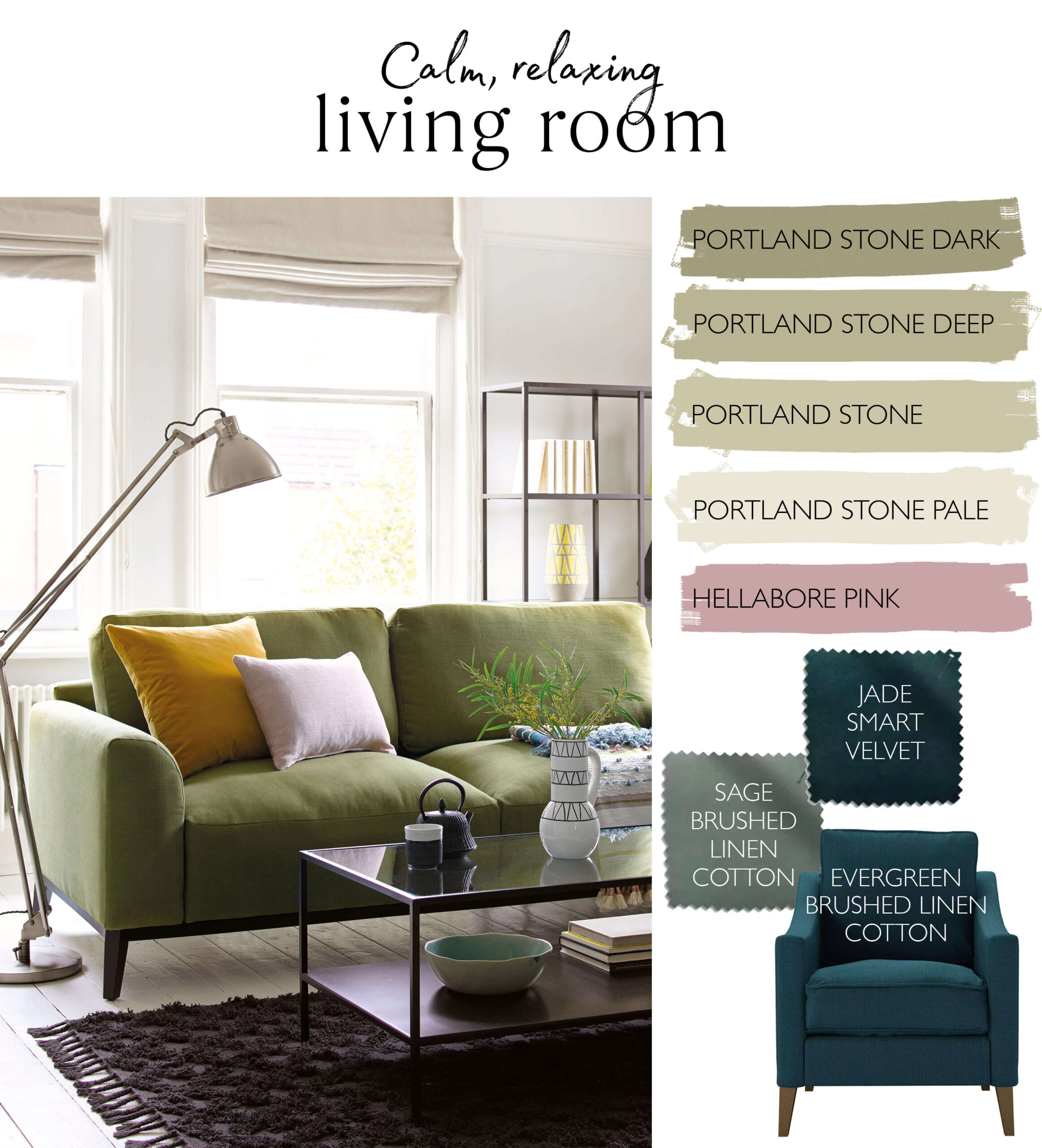
1. How can you create a calming and relaxing living room?
For a living room that is quite spacious, I’d recommend looking at stone tones, such as our Portland Stone family. A family of colours, such as Portland Stone, are all made from the same pigment, but with varying strength, so can be used together to create a colour scheme with subtle variations. You can use the Portland Stone family together, across walls, skirting and the ceiling to create a look that is considered and well put together. You can then pair the warm neutrals with fabrics such as the Royal Fern brushed linen cotton, which brings out the subtle green undertones. Another consideration is to use the Little Greene olive tones in small accents around the room.
For a more sumptuous and sophisticated look, introduce one of sofa.com’s velvets – Sage is the perfect accompaniment to a light room, with Portland stone tones, because it brings out the green undertones without being overwhelming. Another benefit is that Sage is a smart velvet – designed to be extra stain and spill resistant, which is perfect for a family home.
Another colour to add to the Portland Stone family in a light and airy living room is a Hellabore Pink – a gorgeous dusky mid-strength pink, that isn’t too bright or colourful. The simple muted tones help to add a touch of warmth to the room, ensuring it isn’t too cold yet still remains light.

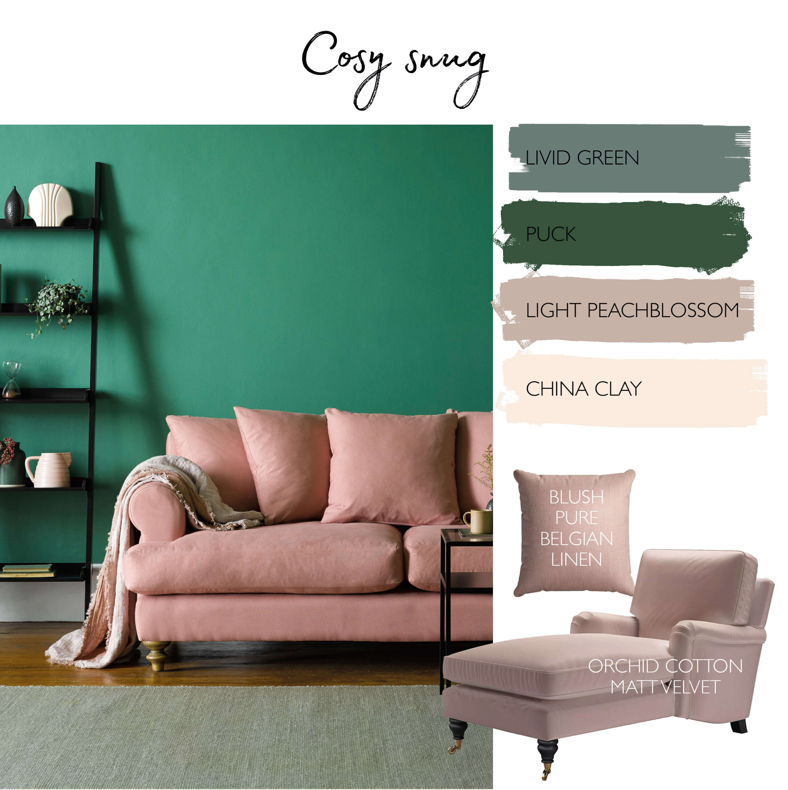
2. How can you create a cosy and inviting snug?
To begin creating the colour scheme, I’m drawn to Livid– a gorgeous bold and deep green, and have paired it with China Clay. For a more contemporary looks, use Livid throughout the room, but for a more classic look, consider using China Clay across the ceiling and skirting, whilst Livid can be used for the walls. The perfect fabric pairing for this look could be sofa.com’s Rhubarb smart cotton – one of their brand new fabrics for AW20! The muted pink tones within this fabric sit nicely against the deep green, and the smart fabric is hardwearing and easy to live with!
Another option for a cosy snug is to combine the Livid and China Clay tones with Peachblossom. This colour has slightly pink and orange undertones, and adds the perfect stepping stone when you introduce sofa.com’s Orchid cotton matt velvet. Silky smooth and with a hint of purple, the Orchid velvet texture really makes a difference on the appearance of a room.

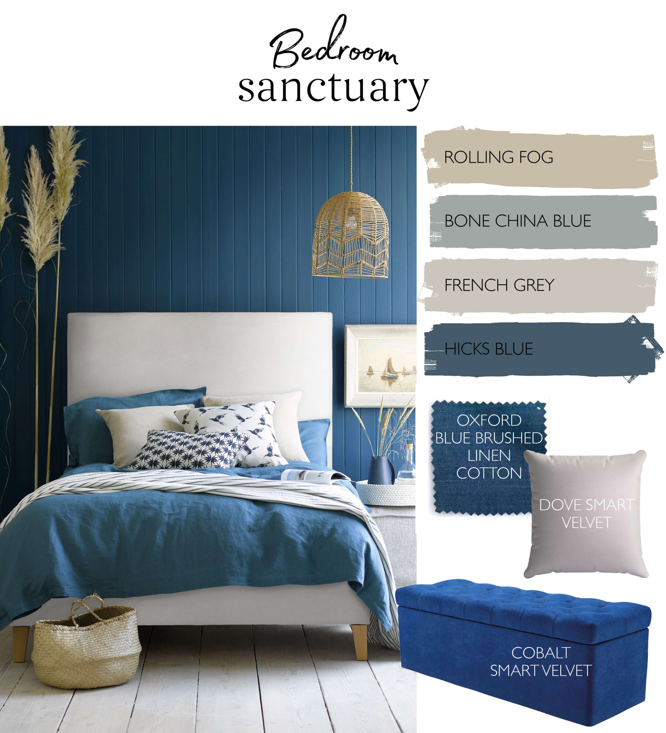
3. How can you create a sanctuary in the bedroom?
For the bedroom I’d suggest considering subtle, soft colours – the Rolling Fog colour family is a good starting point. This colour family has a brown undertone, which works beautifully when combined with Bone China Blue – you could even use the Rolling Fog colour family across walls, ceilings, skirtings and cornices, and use the Bone China Blue for furniture, such as wardrobes, or bedside tables. Team the Rolling Fog and Bone China Blue with sofa.com’s popular Oxford Blue brushed linen cotton to create the ultimate sanctuary, creating a colour scheme similar to a coastal retreat.
Another more contemporary option is to use French Grey, Little Greene’s most popular colour, in the bedroom, as it isn’t too cold. The French Grey tones sit beautifully against Hicks’ Blue, which is a nice bold blue. Of course, if you use the Hicks Blue as a key room colour, try to avoid a blue fabric – instead opt for something soothing like sofa.com’s Dove Grey smart velvet, which will create a relaxed yet luxurious feel.

Ruth’s top tips on being confident with colour
- Always get sample pots of colours you are considering using in the home. Once you’ve applied a sample to the room you are redecorating, look at it at different times of the day, and don’t be afraid to admit that it doesn’t look as good as you’d hoped!
- Every space is individual, so although using social media such as Instagram and Pinterest is a great way to find inspiration, remember that the colours might not look the same in your home.
- There is no rule on what should come first when redecorating a room, but if you’re starting from scratch, consider the flooring first – as this is more permanent. If you have existing furniture, or your heart set on a gorgeous sofa, use this as the basis for your colour scheme and find paints that complement it.
- If you want to make ceilings look higher, why not consider painting the top quarter of the walls the same colour as the ceiling? This will often help lift the room and make it feel bigger.
- Be careful using a bright white on the ceiling if you are opting for a stronger colour on your walls, as this will draw the eyes up and can be too harsh for the rest of the colour scheme. Instead look at softer, neutral shades that have an undertone that fits with the rest of the colour scheme.
source : sofa


